IMPORTANT: When we recorded this podcast episode, shortly after, Pinterest made a change in how they refer to different types of Pins. We used to have Idea Pins, standard Pinterest images, video, carousel Pins, and more. Now everything is just considered a Pin. We still get the best of all formats – including music, tagging, and stickers. In this episode, when we speak of “Pins”, we’re talking about the standard 2×3 ratio Pin.
In this episode, we’ll be sharing part 1 of our 3-part “Back to Basics” Pinterest series – this episode is all about Pin images!
Pinterest images are what we like to refer to as billboard advertising. This is because the average Pinterest user opens up their phone, goes to their app, and begins scrolling their Pinterest home feed.
The home feed is the very first thing the user sees when they open up the app.
They look at the Pin images and see what connects with them. As they’re quickly scrolling, they’re not necessarily “reading”. This is important to note! On Instagram, if users see an image or Reel that seems interesting, they click to the caption to read more.
On Pinterest, they’re just looking at the image for context.
Let’s dive in!
Here’s an example of what it looks like to open up the app and see the Pinterest home feed:
You see an image that says “How to Email Like an Expert”. Sounds interesting!
The text is in big, bold print. It stands out.
You know exactly what you’re going to find on the other side.
So how can YOU build a Pin image like this that catches the eye?
This post contains affiliate links, which means if you make a purchase through these links, we may receive a small commission at no extra cost to you. Click here to read our full disclosure policy.
pinterest image size
Your image has to be the right size. A “standard” or “static” Pin image is 2×3 ratio, or something like 1000×1500 pixels.
In most design software (like Canva), you can choose “Pinterest image” and it will automatically be started at the correct size for the platform.
You may have seen longer Pins, something like 1000×3000 pixels. We refer to these as “giraffe Pins” and were really popular several years ago, because they took up a lot of scrolling space.
But Pinterest caught on and either stopped showing these Pins as much, or cut off the length to a “regular” size Pin and you lost a lot of your carefully designed image.
Best practices on Pinterest? Stick with the size they’re telling you to use. While a LOT of things have changed on Pinterest, the general size of the standard Pin has not changed much.
text overlay on pinterest images
This is the text that is actually ON the image. Not the Pin title or description. On the image itself.
Two reasons you want to use it:
- To give the reader context – If the image you are using as a background is more generic – let’s say paperclips and a gray laptop – you want to make sure your text on the image clearly states what the content is about.
- To indicate to Pinterest what your Pin is about – Pinterest is actually pretty good about “reading” the words on your Pin image. This is something called their “visual search tool”. When Pinterest knows exactly what your Pin is about, they can show it to the audience that most needs and wants to see it.
Do you always need text?
There are two niches that we’ve noticed text overlay does not help, but can actually make things a bit worse.
In the home decor niche, you often want to show the entirety of a room or a full tablescape. Text overlay gets in the way of this.
So in this case, you’ll want to make sure you put more details in your Pinterest description that shows up below the image.
In the fashion niches, if people are searching for the best way to style a certain type of denim, text overlay will just overshadow the image, model, or apparel choice.
when you should always use text
In any type of content or recipe creation, text overlay can add so much context.
Let’s say you have a picture of a bowl of pasta.
It looks delicious – covered in cheese, diced tomatoes, and a beautiful garnish.
But what type of pasta is it? What type of sauce? Can it be made gluten-free or vegan?
With the sheer amount of content on the internet (and Pinterest), adding text can help separate you from the digital crowd.
additional must-haves
YOUR BUSINESS LOGO
It’s important to add a small logo to help with brand recognition. You want people to KNOW that the Pins they’re seeing in their feed are coming from you, even if it takes a bit to recognize your logo.
One caveat here – do NOT add your logo to the bottom right corner. This is where the Pinterest visual search tool shows up, and it will always cover your logo if it’s in that corner.
A CALL TO ACTION
This can be anything that looks like a button to click or a “play now” triangle.
For example: Download Now, Get the Guide, Read More, Shop the Collection.
These can be subtle, but you want the Pinterest user to know that an action is required to see more. The image and text overlay help the user know what the Pin is about, but the call to action tells them they need to actually click to learn more about your content, recipe, or service.
Users often go to Pinterest to find ideas or solutions to their problems, and they do one of two things: click on it right away and take action, or save it for later when they might find it more valuable.
The reason we do this is because when somebody goes onto Pinterest to find all of their ideas, they usually do one of two things. They click on it and take action right away, or save it for later if they find it valuable.
RELATED: Download our free Simple Pin Image Guide for more tips
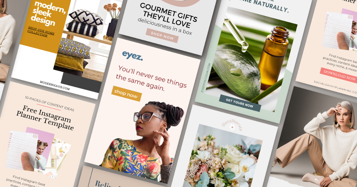
PINTEREST IMAGE BASICS – recap
- Give the Pinner context – use text overlay or a very clear image
- Use the right size – 2×3 or 1000×1500 pixels
- Use a call to action – something that indicates to the user that they need to click
Creating Pinterest images is really hard for some people. A blank space can feel REALLY intimidating.
We do have Canva Pin templates here at Simple Pin, that essentially just show you where all the elements should go. Sometimes starting with a small head start can make all the difference.
Once you have some Pin images created, just keep testing. Just keep trying. Your images might be just awful in the beginning, but over time, you’ll get better and better at it. Or you’ll realize you want to farm it out to someone else. No shame! We all have our strengths.
It’s all trial and error – for everyone.
We’d love to hear from you! Are you a whiz at creating Pinterest images or is that a part of your business that feels awful? Do you use templates or create from scratch? Have you found any tricks that help you cut down on your creation time?
Leave a comment on this blog post or send us a DM on Instagram.
Additional Resources Covered in Podcast:
- Pin Creation Announcement and FAQ (Pinterest images article)
- Pinterest Visual Search Tool
Simple Pin Products and Resources:
- Universal Pin Templates (Simple Pin Shop)
- How to Create Great Pin Images (YouTube video)
- Simple Pin Media Image Design Services


Thank you for all the tips. I am literally creating a pin while listening to this. Thanks again.
So great to hear you’ve found our resources helpful. Happy pinning!
Great tips on optimizing Pinterest images! I never realized how much the size and design could impact engagement. Excited to implement these strategies for my own boards!